Welcome to the new PGATOUR.COM
4 Min Read

New-look home for the PGA TOUR designed to work in concert with our recently-released and redesigned app
Golf’s history has been defined by technological innovation, and not just titanium heads and solid-core balls.
The last century has seen dramatic shifts, from the clubs we use and courses we play to how we consume the game we love.
And it’s this tradition of innovation that has inspired the transformation of our website and app. We wanted to create platforms that bring you new ways to get closer than ever to your favorite players and tournaments.
Welcome to the new PGATOUR.COM
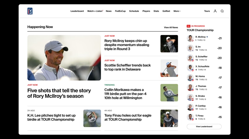
Our reimagined app launched in November and today we’re thrilled to introduce you to the new-look PGATOUR.COM. Our website was redesigned with more intuitive navigation to streamline your access to the content and information you need. A sleek new look provides more room for stories, videos and data.
And the live leaderboard is always immediately accessible, ensuring you always know what’s happening within the competition.

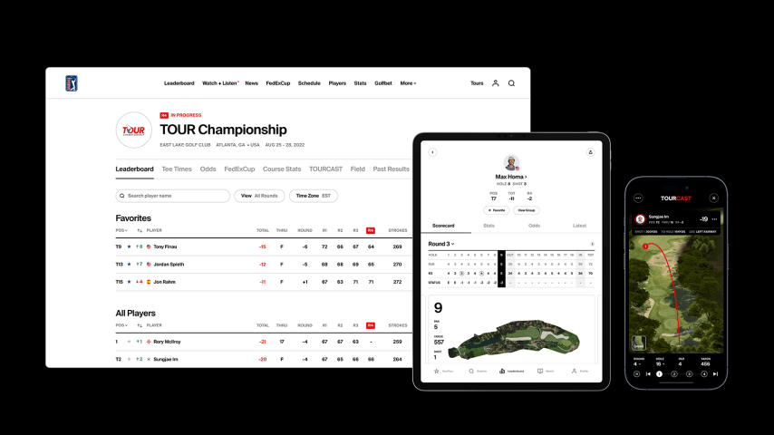
Together with our reimagined app, our aim is to provide you a consistent experience across platforms by designing both the app and website with the same foundational principles. Every change was made with clarity and purpose to ensure we achieved our most important objective – serving the world’s best fans.
We enlisted the award-winning firm Work & Co – who has designed products for everyone from AB-InBev to Disney – to assist us in this process, as well as Captech, Ensemble and Shockoe. We also received invaluable assistance from our partners at Adobe, AWS, CDW and Qualtrics.
What does all this mean for you? You’ll see new experiences that bring a deeper understanding and enjoyment of the game’s traditions AND an embrace of the innovation that brings you closer to the action. The game’s biggest stars will shine brightly while the pathways that make the game unique – the Tours where future stars are born as they advance to the pinnacle of their sport – are elevated.
The unified look and feel ensures users a seamless transition from our website to app, and across our Tours. This will make it easier to access the information you need, whether it’s the unparalleled depth of scores and statistics or the content that forges your connection with our players and courses.

The app and website provide a clean look and immersive feel, with rich visuals, deep data and enhanced storytelling. Just like the slightest change to a player’s swing is made with great intention and purpose, every feature of these new platforms, from the fonts to the colors, is imbued with significance to enhance your experience.
But this is not just a redesign. It’s a fresh start. Everything was rebuilt, including the technology that supports the app and website. What does this mean? Faster data and statistics. Quicker load times. Uninterrupted engagement.
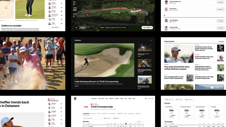
Short-form video and clear content hierarchies clearly communicate what’s important, while seamless design makes it easier to dive into the topics that interest you. Our players – the ones you cheer on as they chase history each and every week – are elevated through engaging imagery that conveys the emotions that are inherent when true competition is on the line.

The course is their canvas, and these platforms will bring you new perspectives on these historic settings through the use of stunning aerial photography and video.
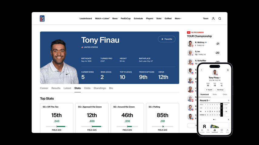
And we may have unparalleled amounts of data, but it is meaningless if it can’t offer insights. By adding visualizations and context to our statistical displays, we let the numbers tell the story in a manner that is easy to digest.
All of this is supported by a minimalist design that offers clarity and focus by embracing white space and reducing elements to their essential form. The most important content is easily accessible and brought to life with compelling visuals that are accompanied by calls to action so you can engage deeper in your favorite topics.

The fonts communicate the game’s enduring appeal, while the colors draw upon the stunning beauty of golf’s venues. The serif (Tobias) and sans-serif (Suisse International) fonts are complementary players that elevate communication by harkening on the past and paying homage to golf’s origins while also looking ahead to the future.
Our color palettes were inspired by the expansive vistas of the TOUR, constructed of bold, playful accents while supporting neutrals and tones that help ground each touchpoint.
So much has changed, but this isn’t the end. It’s the beginning. Successful designs are long-lasting and continually evolving.

In the coming months, we’ll be adding even more features, including deeper personalization and the ability to connect your accounts for tickets, streaming and gaming so that all those experiences will be consolidated on one platform. We’ll be adding new elements of TOURCast into the app, as well, putting even more of that award-winning product and its 3D shot trails in your pocket. You can follow a single player or a group, seeing the stats behind their shots just seconds after they’re struck. Future integration of augmented reality and new features will enhance your on-site experience, as well. So whether you’re at home or walking outside the ropes, these new products will bring you closer to the action.
We’ll continue to listen to your feedback from fans and quickly respond with enhancements to the app and website along the way.